This lesson explains how to read a price chart. Nothing here is a recommendation to buy or sell anything. Examples are illustrations of how the concepts work, not trade calls. Always do your own research and speak to a licensed adviser before risking money.
Most people look at a chart and see a wiggly line. They squint at it, decide it "looks bullish" or "looks bearish," and place a trade based on a feeling. That is not reading a chart. That is reading your own mood.
A price chart is not a picture of the past. It is the live record of a fight — every bar is the footprint of thousands of buy and sell decisions, real money won and lost, hope and fear printed in pixels. Once you learn to read that footprint, a chart stops being decoration and starts being information.
This guide breaks down exactly what each bar and candle is telling you: what the open, high, low and close actually mean, why the close matters more than the rest, and how the "support" and "resistance" everyone talks about are really just the memory of the crowd. The framing here leans on a classic of the genre — Alexander Elder's The New Trading for a Living — paraphrased and built out in our own way.
First, a Warning: The Chart Is an Inkblot Test
Before any of the mechanics, you need to know the single biggest trap in charting. Elder put it perfectly: most traders use a chart like a Rorschach inkblot test.
A century ago, the psychiatrist Hermann Rorschach dripped ink on paper, folded it, and asked people what they saw. There was nothing on the page but ink — yet people described animals, faces, weapons, whatever was already living in their head. The blot was a mirror.
Charts work the same way on an undisciplined trader. If you want the market to go up — because you are already long, or you are itching to buy — you will find a bullish pattern. If you are bearish, the same chart suddenly looks like a top. The chart didn't change. Your wishful thinking did.
So the first rule of reading a chart is to read what is actually there, not what you hope is there. Everything below is about training that discipline.
Every Price Is a Vote
Start with the smallest unit: a single price. What is it, really?
A price is the exact level where, at that instant, a buyer and a seller agreed to do business. Nothing more, nothing less. It is a momentary consensus of value — the whole market saying, "right now, this is what it's worth," and then immediately arguing about it again.
Stack thousands of those agreements together and you get a chart. A chart is a running poll of every participant with money on the line: institutions, funds, algos, and retail traders all voting with real capital, tick by tick. That is why it carries information a newspaper never can — people lie in interviews, but it is expensive to lie with your own money.
The Anatomy of a Single Bar
Almost every chart you will ever trade is built from one repeating building block, drawn once per time period — one per day on a daily chart, one per hour on an hourly chart, and so on. Each one packs four numbers: the open, high, low and close (OHLC). Learn to read those four and you can read any chart on any timeframe, because the logic never changes.
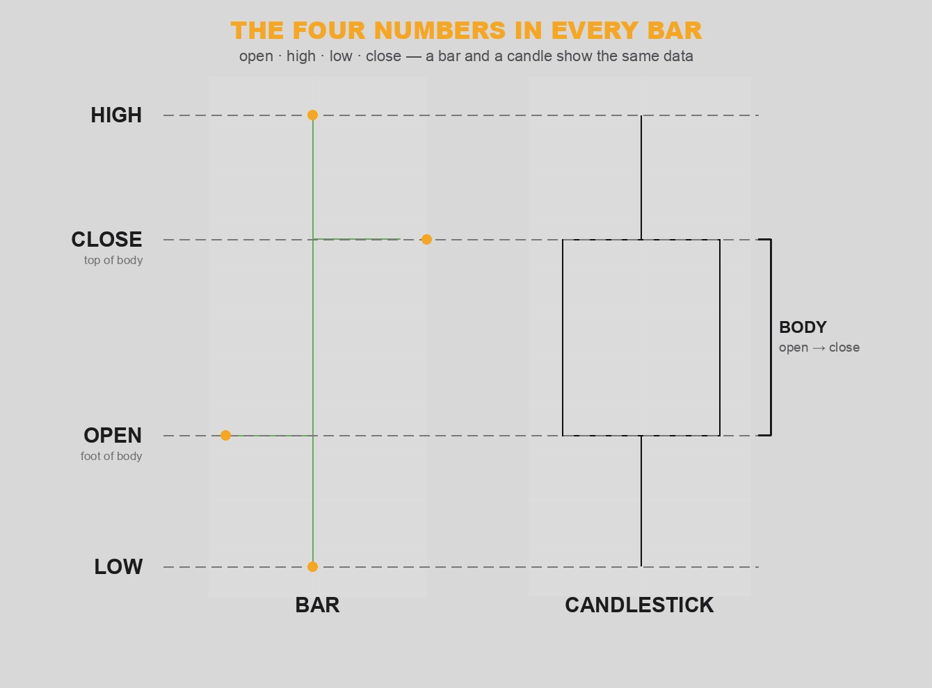
The four numbers in every bar: open, high, low, close. A candlestick draws the same data — the body spans open-to-close, the thin wicks reach to the high and low.
The Open — the amateur's opening move
The open is where the period begins. It tends to be set by the part of the crowd that decides overnight and acts first thing — people who read the morning headlines, form an opinion, and fire off orders before they get on with their day. That crowd is often more emotional and less informed, which is why opens frequently land near one extreme of the bar and then get faded as cooler heads take over.
The Close — where the professionals settle it
The close is the most important number on the bar, full stop. It is where price finally settled after a full session of fighting, and it tends to reflect the players who trade all day, react to everything, and dominate the final stretch — the professionals. When you mark your account at the end of the day, you mark it at the close. So that is the number that actually mattered.
The relationship between the open and the close tells you who won:
- Close above the open → buyers controlled the settle. On a candlestick this prints a bullish (usually green/hollow) body.
- Close below the open → sellers controlled the settle. This prints a bearish (usually red/filled) body.
- Close near the high → bulls won the period convincingly.
- Close near the low → bears won, and the close drove it home.
The High — the high-water mark of the bulls
The high is the furthest price buyers managed to push before they ran out of fuel. It is the maximum power of the bulls for that period, frozen in place. Every tick up was buyers lifting price; the high is the exact point where they could not lift it one tick more.
The Low — the high-water mark of the bears
The low is the mirror image: the furthest sellers managed to drive price down before they ran out. It marks the maximum power of the bears for that period.
The Range — how hard they fought
The distance from high to low — the bar's range — measures the intensity of the battle. It is the market's temperature:
- A tall bar (much bigger than the recent average) = a boiling, emotional market where bulls and bears fought all over the field. Big news, big emotion.
- A short bar = a sleepy, indecisive market where nobody cared much. Low conviction on both sides.
There is a practical edge in this. Trying to jump in right as a giant bar is running is like leaping onto a moving train — the easy money has already been made and slippage is brutal. Calm, normal-sized bars are usually a safer place to enter; the wild ones are better for taking profits into.
Bars vs Candlesticks: Same Data, Different Clothes
A bar chart and a candlestick chart show the exact same four numbers. The only difference is presentation.
Japanese rice traders were charting with candles centuries before the first Western chartists showed up — the technique was later popularized in the English-speaking world by Steve Nison. A candle takes the open and close and draws them as a fat body, then draws thin wicks (or "shadows") out to the high and the low. Because the body is colored, the open-to-close relationship — who won — jumps out at you instantly. That is why most traders today prefer candles: they make the most important relationship on the chart impossible to miss.
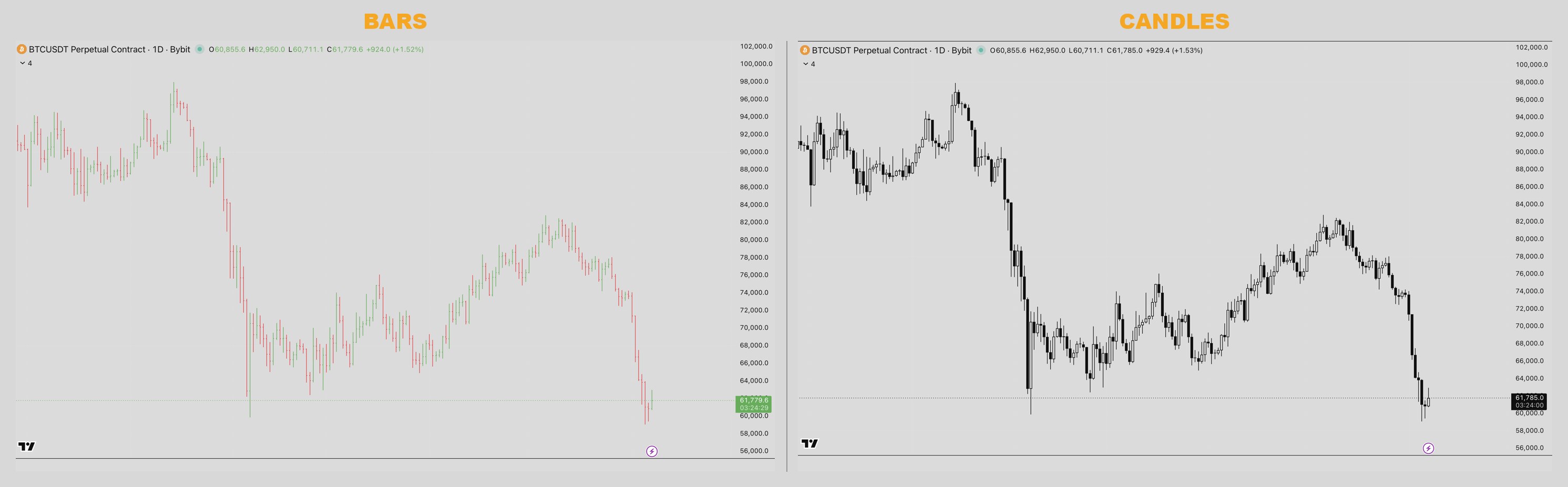
The same price action as bars (left) and candles (right). Identical open/high/low/close — the candle just makes the body, and therefore the winner of each period, far easier to read at a glance.
Reading a candle's wicks
The wicks are where the real psychology hides. A long lower wick means sellers shoved price way down during the period — and then buyers rejected it and dragged the close back up. That is a footprint of buyers defending a level. A long upper wick is the opposite: buyers pushed up, sellers slammed it back down. Wicks are rejection. The bodies tell you who won; the wicks tell you where the other side put up a fight.
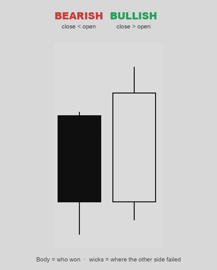
Left: a bearish candle (close below open). Right: a bullish candle (close above open). The long wicks show where the losing side tried, and failed, to take control.
Why Charts Work At All: The Memory of the Crowd
Here is a fair question: if markets are supposed to be efficient and random, why would reading squiggles tell you anything?
The academic camp says it can't. The Efficient Market theory says price already reflects all known information, and the Random Walk crowd says the next move is a coin flip. Warren Buffett's famous jab at the efficient-market believers was that he was happy to compete against people who'd been taught it's pointless to think.
The flaw in those theories is that they assume people are robots. They aren't. Markets are made of humans, and humans have memory and emotion. You remember the price where you bought. You remember the level where you got hurt, or where you finally took profit. And when price comes back to that level, you act on the memory — you buy again, or you bail, or you double down to "get even."
Multiply that across millions of participants and something powerful happens: prices leave repeatable footprints. The crowd's collective memory is what creates a floor under the market and a ceiling over it. That is not magic. That is just a lot of people remembering the same number.
Markets aren't perfectly orderly either — most of the time they are messy. But out of the chaos, islands of order keep forming and dissolving. The whole job of a chart reader is to spot those orderly patterns when they appear and have the discipline to act on them, then stand aside when the market turns to noise.
Support and Resistance: The Floor and the Ceiling
That crowd memory has a name when you draw it on a chart: support and resistance.
Picture a ball bouncing in a room. It falls, hits the floor, and bounces back up. It rises, hits the ceiling, and drops back down. Price does the same thing between two invisible levels:
- Support is the floor — a price level where buying has reliably overwhelmed selling, so downtrends keep stalling and bouncing. It is where buyers remember stepping in, so they step in again.
- Resistance is the ceiling — a level where selling has reliably overwhelmed buying, so uptrends keep stalling and rolling over. It is where sellers remember taking profit, so they sell again.
The more times a level has been tested and held, the more traders remember it, and the more important it becomes. And there is a neat twist worth knowing early: when price finally smashes through a strong support level, that old floor often flips into a new ceiling on the way back up — and vice versa. Broken support becomes resistance, because the crowd's memory of the level doesn't disappear; it just changes sides.
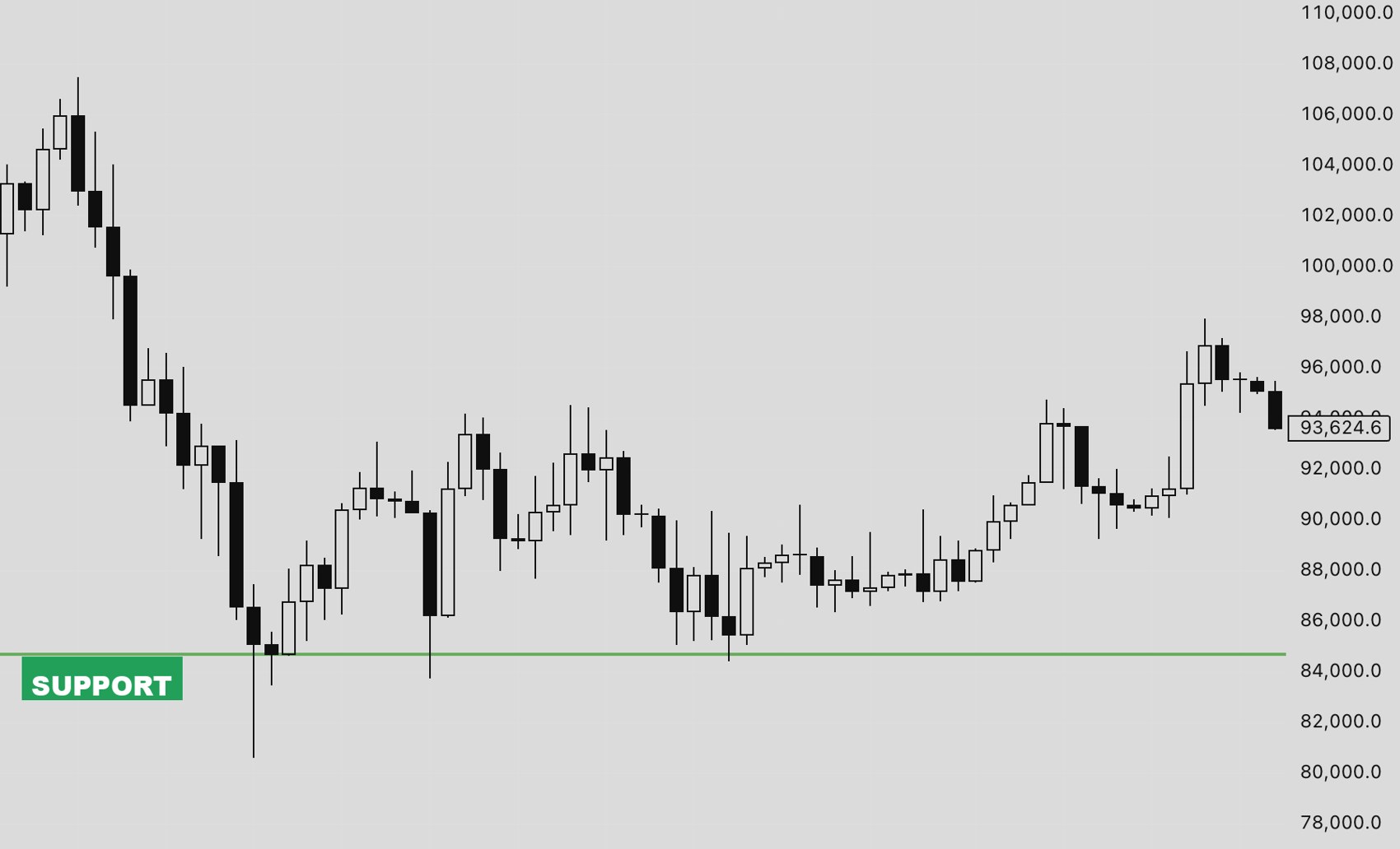
A support level (the floor) drawn on a real Bitcoin chart — notice how many times price falls to the same area and bounces. Resistance is the exact same idea flipped: a ceiling overhead where sellers keep stepping in.
A Quick Word on Where This Came From
Reading charts isn't a fad. Western technical analysis traces back to Charles Dow at the turn of the twentieth century — the same Dow behind the Dow Jones averages and the idea that "the averages discount everything." His thinking was carried on by editors like William Hamilton and Robert Rhea, and the 1930s became a golden age of charting after the 1929 crash gave a lot of analysts time to think. In 1948, Edwards and Magee formalized the patterns — triangles, head-and-shoulders, support, resistance, trendlines — in Technical Analysis of Stock Trends, still a reference today. The candlesticks you stare at are older still, born with Japanese rice traders centuries ago.
You don't need to memorize the history. But it helps to know that when you read a chart, you are using a language that has been refined by serious people for over a hundred years.
How to Actually Practice This
Reading charts is a skill, and skills come from reps, not from reading one article. Here is a simple drill:
- Open a clean daily chart of something you care about — Gold or Bitcoin are great because they move with real emotion.
- Pick any ten candles in a row and read them out loud, left to right, as a story: "Buyers opened it, pushed to the high here, sellers slammed it back, close came in near the low — bears won the day."
- For each candle, say who won (close vs open), how hard they fought (the range), and where the loser tried (the wicks).
- Mark the prices where the chart keeps reacting. Those are your support and resistance levels — drawn from the chart's own memory, not your opinion.
- Do this for ten minutes a day. Within a couple of weeks you will start "seeing" the fight instead of a wiggly line.
That is the whole game. A chart is a fight between bulls and bears, recorded honestly in money. Learn to read the open, high, low and close on a single bar, respect the crowd's memory at support and resistance, and refuse to turn the chart into a Rorschach test for your own hopes — and you are already ahead of most people clicking buy and sell.
Once you can read raw price, the next step is adding a couple of simple tools on top. Our guide on trading EMA crosses and pullbacks is a natural next read — moving averages are just a way of tracking the same crowd behavior automatically.